BayWa r.e.
New ux design: how a user-friendly navigation concept is created
The task:
Easier to unterstand, faster, more striking. This is what BayWa r.e. from Munich wanted for the new navigation of their photovoltaic wholesale shop.
Our solution:
We designed the navigation from the user’s point of view. We attached importance to a logical navigation structure in terms of content, an arrangement that conforms to expectations and a visually sensible weighting of the navigation levels.
The process:
PHASE #1
Analysis
Understand the company and business model. Get to know the client's requirements. Conduct interviews with clients. Analyze current navigation. Implementation of competition analysis. Determine the direction for further action.
PHASE #2
UX- and design process
Develop various ideas and approaches in an iterative process and coordinate them closely with the client. Elaboration of the preferred approach. Creation of all design specifications for the development agency. Plan and define UX animation.
PHASE #3
Production and support
Creation of production documentation with description of the detailed behavior when clicking, hovering, etc. Visualize animation with the help of interactive prototypes. Coordination with external development agency, production support and quality assurance.
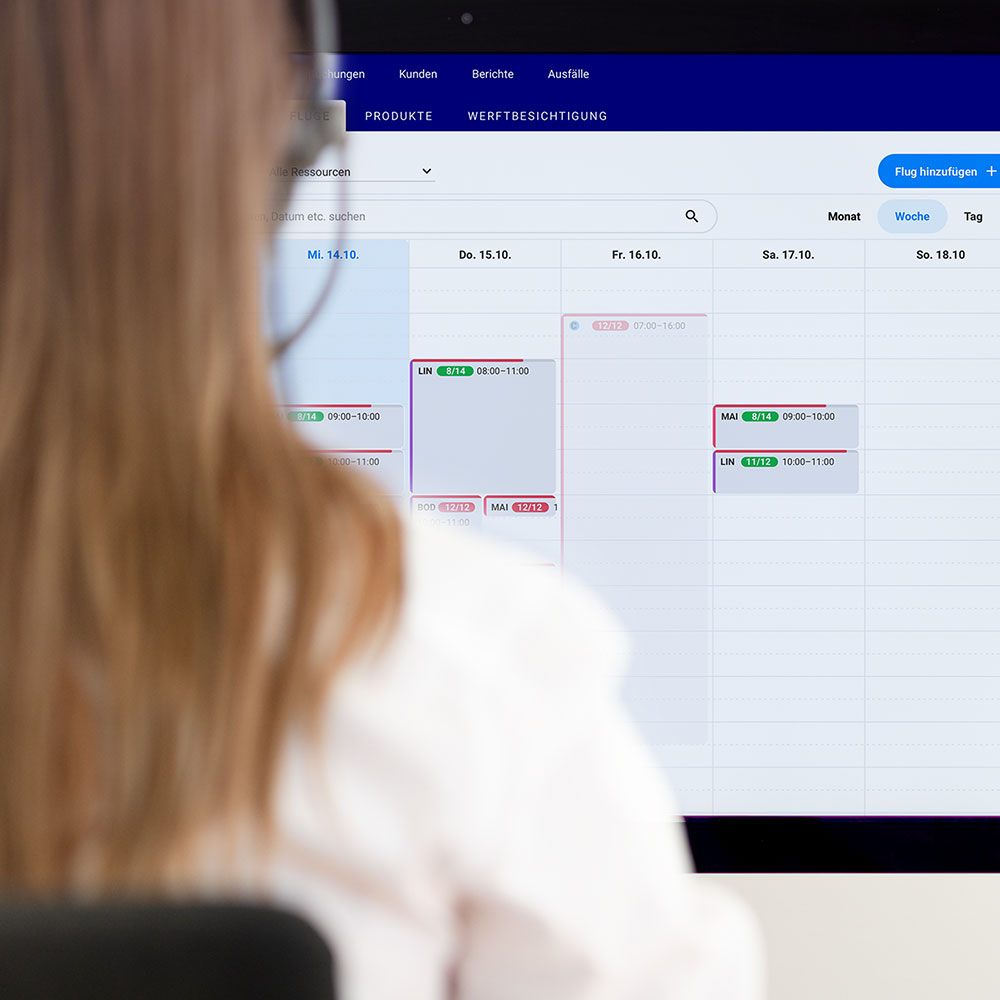
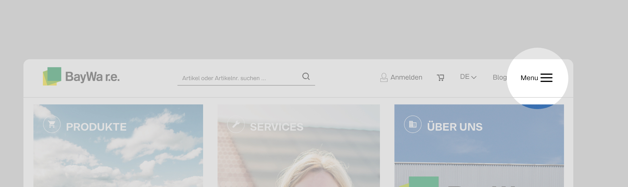
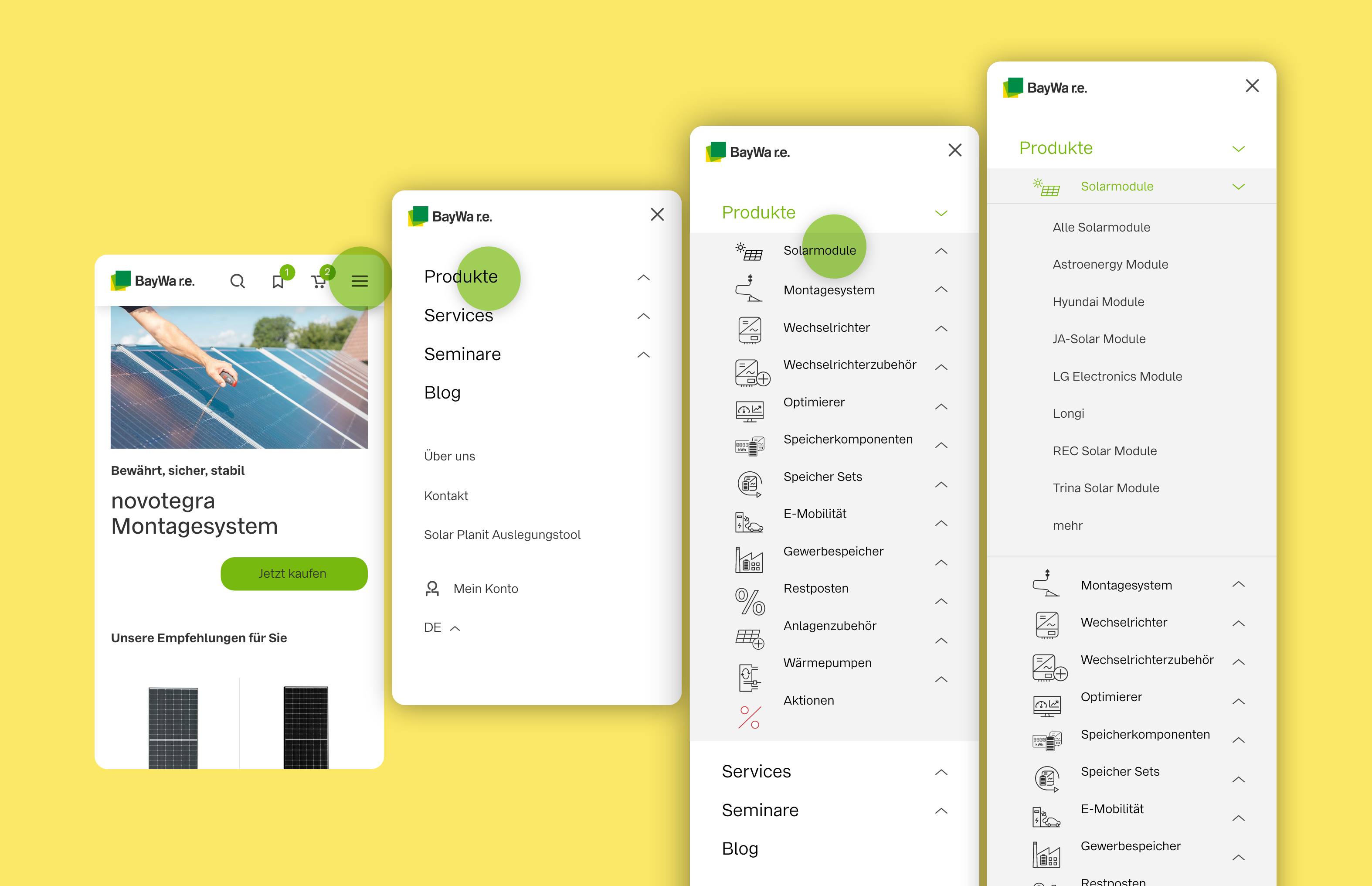
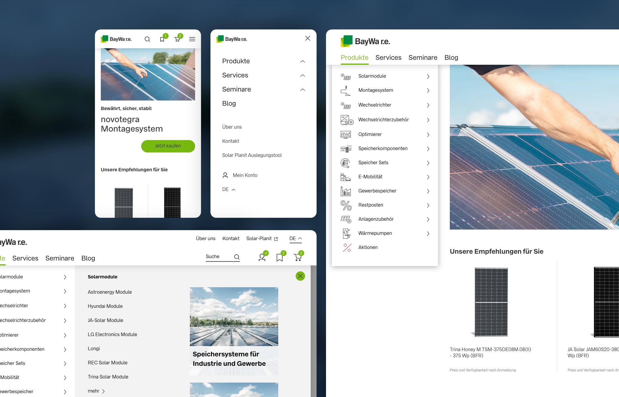
Before: We noticed the burger menu in the desktop view as the central pain point in the previous navigation concept. The user has to actively click on the menu in order to see the main navigation points and to get an overview of what is on offer.
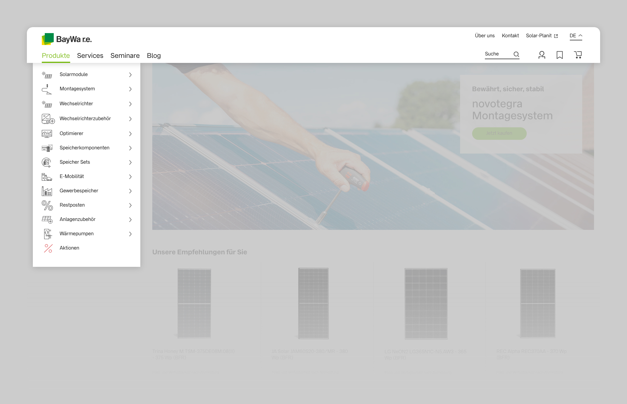
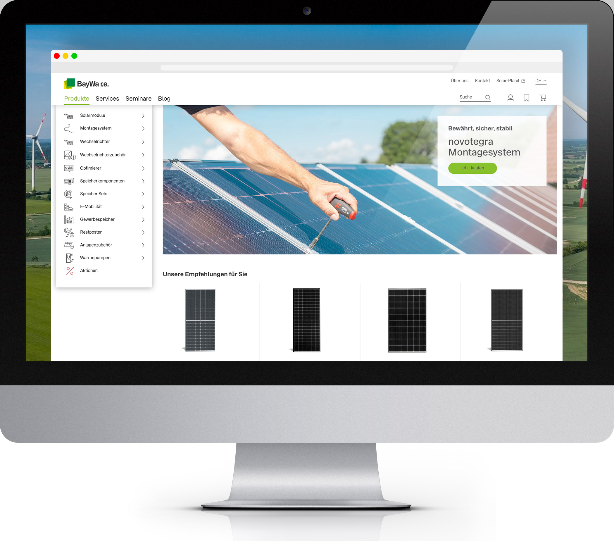
After: The main menu items are now clearly visible in the header. For a quick introduction to the shop offer, the product menu on the start page is displayed by default.
Brand-compliant: When implementing the design, we take into account the corporate design specifications of the group in order to ensure recognition and to convey the brand values in the navigation.
Why clear navigation is important even in the age of Google:
Understandable and clear navigation is still the backbone of every user-friendly website. This also applies in times when SEO is becoming more and more important and more and more users are directed to a specific subpage via Google. The task of navigation here is to show the user where he is currently, what else is available and how he can get to the other content that might interest him.
„Imagine waking up in the middle of your website – how do you know where you are right now?“
This applies not only to corporate sites, but even more so to commercial online shops. Poorly designed and inefficient navigation can quickly frustrate customers and lead them to take their business elsewhere.
Mobile First: A mobile-optimized navigation concept ensures smooth operability on smartphones.
Animating: flowing transitions that illustrate the opening and closing of layers or mouseover animations for interaction elements guide the user safely through the navigation flow.
Projektteam:
BayWa r.e.
Dominic Rheinwald · Head of Global Digital Marketing
Nalin Sudan · Head of E-Commerce
H2D2
Johannes Reinhart · UX/UI Designer
Markus Remscheid · Productowner
Technical implementation
Projekt eins
The client
BayWa r.e.
Our services
UX & UI DesignE-Commerce DesignDesign systemsResponsive design
Launch
January 2022